There is a moment in every automated translation workflow that determines whether the tool becomes a permanent part of your process or gets abandoned after the second try. It happens when you look at the output from an AI Image Translator and notice something slightly off—a line break that doesn’t sit right, a font weight that feels too light against the background, or a translation that’s technically correct but awkwardly placed. Most tools give you that moment and nothing else. You either accept the imperfection or start over from scratch. That binary outcome has quietly shaped how professionals think about image translation: it’s a convenience, not a reliable production tool. But the introduction of a proper translation editor changes that equation in ways that become obvious only when you actually need to fix something.
The Real Test Is What Happens After the Translation
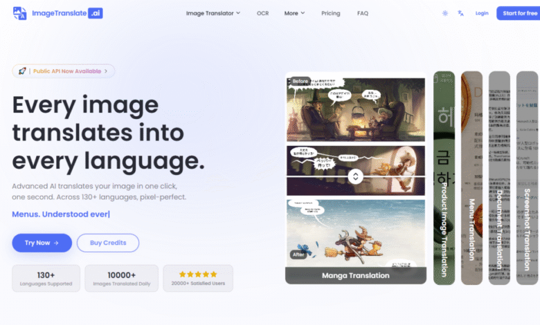
The initial translation pass is impressive. Upload a screenshot of a software interface with Chinese labels, select English as the target, and within seconds the tool returns an image where every button and menu item reads naturally in English while staying exactly where it belongs. The OCR catches the text, the translation handles the terminology, and the layout preservation keeps everything visually coherent. That much works as advertised.
But the real test comes when the output isn’t quite right. Maybe the AI chose a font size that’s slightly smaller than the original, making a headline look understated. Maybe a translated product name is longer than the source text and the AI’s automatic resizing compressed it awkwardly. Maybe you’re working with a brand guideline that specifies exact font weights and colors, and the AI’s best guess doesn’t match.
This is where the Translation Editor becomes the deciding factor between a tool that’s useful and one that’s actually dependable for professional work.
What the Translation Editor Actually Lets You Do
The editor opens after the initial translation completes, displaying your image with each translated text block selectable and editable. The interface is straightforward: click on any text element, and you can modify the translated text directly, adjust the font, change the color, resize the element, or reposition it on the image.
Per-Block Control Without Destructive Overwrite
Each text block operates independently. You can edit one speech bubble without affecting the adjacent ones, adjust the color of a product label while leaving the description untouched, or resize a headline without altering the body text. This granularity matters when you’re working with complex layouts where different text elements serve different visual purposes.
Original and Hidden Modes for Visual Comparison
Two editor features add practical utility beyond basic text adjustment. The Original mode lets you toggle a specific text block back to show the source artwork, which is useful when you’re comparing the AI’s placement against the original design. The Hidden mode removes the text entirely, giving you a clean view of the background to check whether the translation is obscuring any important visual elements.
These modes aren’t flashy, but they solve real problems. When you’re adjusting a translation and need to verify that the original had a specific visual treatment, toggling between states is faster than keeping a separate reference image open.
Testing the Editor Under Real Conditions
To understand whether the editor actually delivers on its promise, I ran a series of tests designed to expose its limitations rather than showcase its strengths.
Scenario: E-Commerce Product Badge with Color Constraints
A product image included a “20% OFF” badge in a specific shade of red that matched the brand’s identity. The AI translated it to “20% RABATT” for a German listing and applied a generic red that was close but not exact. Using the editor, I selected the badge text, pulled the color picker, and matched the original hex value. The result was visually identical to the source design. The editor’s color accuracy was precise enough that the adjustment was invisible in the final output.
Scenario: Manga Panel with Tight Bubble Constraints
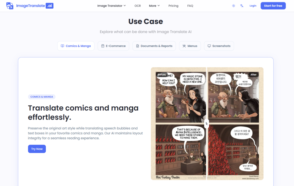
A manga page featured a speech bubble with minimal clearance around the text. The AI’s translation was slightly longer than the original Japanese, and the automatic resizing compressed the text to the point of being uncomfortable to read. The editor let me reduce the font size incrementally until the text fit cleanly within the bubble boundaries. The adjustment was small but made the difference between a page that looked professionally translated and one that looked like a rough draft.
Scenario: Technical Document with Mixed Font Weights
A software documentation screenshot used bold headers and regular-weight body text. The AI preserved the distinction in most places but misidentified one header as body text, applying the wrong weight. The editor fixed this with a single dropdown selection. The correction was trivial in effort but significant in the final visual hierarchy.
Where the Editor Falls Short
The editor is not a full design tool, and it doesn’t pretend to be. You can adjust fonts, colors, sizes, and positions, but you cannot modify the underlying image background, add new visual elements, or perform complex compositing. If the AI’s OCR completely missed a text region, the editor won’t help you add it back—you’d need to re-upload and try again.
The editor also operates within the constraints of the AI’s initial text detection. If the OCR misidentified a word boundary or merged two separate text elements into one, the editor gives you control over the translated content but not over the segmentation. In my testing, this was rarely an issue with clean, well-lit images, but it became noticeable with low-resolution or heavily stylized text.
The learning curve is minimal—the interface is intuitive enough that you can start making adjustments without a tutorial—but the editor’s capabilities are deliberately scoped. It’s a refinement tool, not a creation tool.
Who Benefits Most from the Editing Layer
The editor changes the risk calculus for different types of users in distinct ways.
For designers and brand managers, the ability to match exact colors and fonts means the tool can be used for final assets rather than just drafts. You’re not handing off a “close enough” translation to a design team for rework; you’re delivering a finished image that meets brand standards.
For content managers handling multilingual websites, the editor provides a safety net for edge cases. When a translated product name breaks awkwardly across two lines, you can fix it immediately rather than escalating to a designer or re-exporting from scratch.
For manga and comic translators, the editor addresses the perennial problem of text fitting within speech bubbles. The AI handles most cases well, but the ones it doesn’t handle perfectly are precisely the ones where manual adjustment makes the biggest visual difference.
For casual users, the editor may feel like overkill. If you’re translating a menu for personal travel, the AI’s default output is probably sufficient. The editor becomes valuable only when visual quality matters beyond basic readability.
The Broader Implication for AI Translation Tools
The presence of a capable editor signals something about the tool’s design philosophy. It acknowledges that AI translation, even at its best, produces results that benefit from human refinement. This is not a failure of the technology; it’s a realistic assessment of where machine translation sits in the workflow.
Tools that present their output as final and unchangeable force users into an all-or-nothing relationship with the AI. You either trust the result completely or reject it entirely. The editor creates a middle ground where you can trust the AI for 90 percent of the work and handle the remaining 10 percent manually. That middle ground is where most professional work actually happens.
The editor also reduces the cost of experimentation. When you know you can fix minor issues after the fact, you’re more willing to try translations on images you might otherwise have skipped. The safety net changes behavior, and changed behavior leads to broader usage.
A Practical Comparison of Post-Translation Control
| Aspect | With Translation Editor | Without Translation Editor |
| Text Correction | Edit any translated text block directly | Re-upload and re-translate the entire image |
| Font Adjustment | Change font family, weight, and size per block | Accept the AI’s automatic choice or start over |
| Color Matching | Pick exact colors to match brand guidelines | Live with the AI’s approximation |
| Positioning | Drag text blocks to precise locations | No control over placement |
| Visual Comparison | Toggle between original and translated states | Keep a separate reference image open |
| Rework Cost | Seconds per adjustment | Full re-translation cycle |
The table isn’t meant to suggest that every translation needs editing. Many outputs are perfectly usable straight from the AI. But when an adjustment is needed, the editor turns what would have been a frustrating restart into a quick, painless fix.
What the Editor Doesn’t Replace
The editor is a refinement layer, not a replacement for the AI’s core capabilities. It cannot compensate for poor OCR, cannot fix translations that are linguistically incorrect, and cannot recreate text that the AI failed to detect. The quality of the editor’s input depends entirely on the quality of the AI’s initial work.
For users who need absolute pixel-perfect control over every aspect of the image, the editor will feel limited. It’s designed for adjustments, not for building an image from scratch. If your workflow requires full design control, you’re better served by manual editing in a dedicated design tool.
But for the vast majority of image translation tasks—where the AI gets most things right and only a few details need tweaking—the editor bridges the gap between automated convenience and professional quality. It AI Image Translator makes the tool usable in contexts where “good enough” isn’t good enough, without demanding that every user become a designer.
The editor is not the headline feature. It’s not what the marketing materials lead with, and it’s not the reason most people first try the service. But in practice, it’s the feature that turns a promising tool into a dependable one. When the AI gets it right, you move on. When it gets it slightly wrong, you fix it and move on. Either way, you keep moving.