Data Visualisation in Academic Research: Principles Every Researcher Should Know
Introduction
Data visualisation is one of the most powerful tools in a researcher’s communication arsenal, and one of the most frequently misused. A poorly designed chart can obscure findings, introduce bias, or actively mislead readers. A well-designed one can make a complex statistical relationship immediately intuitive to any reader. This guide covers the foundational principles every researcher should apply to their visual communication.
The Primacy of Clarity
Edward Tufte, whose work on data visualisation remains foundational, coined the concept of the ‘data-ink ratio’: the proportion of a chart’s ink that is devoted to representing actual data rather than decorative elements. High data-ink ratio charts strip away everything that does not serve the data — gridlines that are not needed, three-dimensional effects that distort perception, decorative borders, unnecessary colour variation.
Before adding any visual element to a chart, ask: does this make the data clearer? If not, remove it. The discipline of subtraction is harder than addition in design but yields dramatically better results.
Choosing the Right Chart Type
The most common data visualisation mistake is choosing a chart type that feels familiar rather than one that suits the data. Bar charts compare discrete categories. Line charts show continuous change over time. Scatter plots reveal correlations between variables. Pie charts show part-to-whole relationships — but only work well with a small number of clearly distinct segments.
Heat maps, violin plots, and box-and-whisker charts are valuable for showing distributions and variability that summary statistics would obscure. Network diagrams reveal structural relationships. The right chart type makes your finding immediately apparent; the wrong one makes readers work unnecessarily hard to extract meaning.
Colour as Communication
Colour in data visualisation is not decoration — it is information. Use colour to encode meaning, not to make charts look attractive. Sequential colour scales (light to dark) work for ordered data. Diverging colour scales work for data with a meaningful midpoint (above and below zero, for instance). Categorical colour scales use distinct, clearly differentiable hues for unordered groups.
Always check your colour choices for accessibility. Approximately 8% of men have red-green colour deficiency — the most common form — which makes red-green distinctions invisible. Tools like Color Oracle allow you to preview your visualisations as colour-blind readers see them. Accessible design is not a compromise; it is a higher standard.
Scales, Axes, and the Temptation to Mislead
Visual communication carries significant ethical responsibilities. Truncating the Y-axis to make a modest difference look dramatic, using inconsistent scales across panels, or cherry-picking time periods are common practices that mislead readers, sometimes intentionally and sometimes through carelessness. Academic visualisations should always show the full range of data, use consistent scales across comparable charts, and clearly label all axes with units.
When uncertainty is part of your data — and in most research it is — represent it visually. Error bars, confidence intervals, and probability distributions tell a more honest story than point estimates alone.
Designing for Print
Visualisations designed for screen presentation often fail in print. Vector graphics (SVG, PDF, EPS) scale perfectly to any print size; raster formats (PNG, JPG) become pixelated when enlarged beyond their original resolution. For poster presentations, always export your visualisations in vector format or at 300 DPI minimum at your target print size.
Colours also behave differently in print than on screen. Your monitor displays colour using light (RGB); printers use ink (CMYK). Bright screen colours, particularly highly saturated blues and purples, often print differently than expected. Request a proof print before committing to your final order where possible.
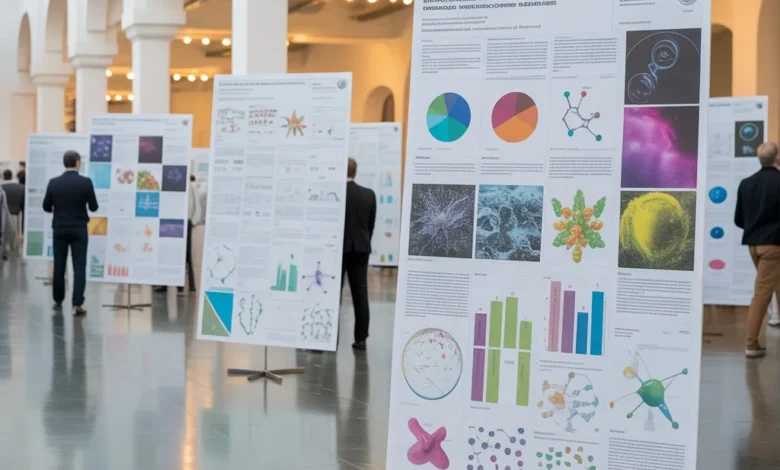
Presenting Data Effectively at Conferences
Academic conference posters live or die by their data visualisations. A research poster that presents findings through clear, professional-quality charts will engage delegates far more effectively than one that buries data in tables or reproduces small-format journal figures that become unreadable at poster scale.
Similarly, an infographic poster approach — which prioritises visual narrative over comprehensive data reporting — is increasingly appropriate for interdisciplinary conferences or public-facing academic events where audiences may not share your specialist vocabulary. The question is always: what does this specific audience need to take away from this visualisation?
Common Mistakes to Avoid
Three-dimensional charts distort perception and add no information value — avoid them without exception. Dual Y-axes are almost always a sign that two datasets should be presented in separate charts rather than combined. Decorative icons and illustrations that do not encode data add cognitive load without adding information.
Perhaps most importantly: never present a visualisation you do not fully understand yourself. If you cannot explain exactly what a chart is showing and why you made the design choices you did, it is not ready for public presentation.
Conclusion
Data visualisation is a discipline that rewards study and practice. The principles covered here — clarity over decoration, purposeful colour, ethical axis design, format-appropriate export — are the foundation of every effective research visualisation. Apply them consistently and your data will communicate far more powerfully than any prose description could achieve alone.