A dramatic station image can make a service change look like a photographed incident. A dark platform suggests danger. A crowd implies disruption. A broken signal looks like a confirmed cause. When those details were generated only to make an article easier to scan, the visual has started making factual claims that the reporting never established.
Transport desks need a sharper division of labor. Verified route names, times, closures and causes belong in an editable fact layer. Generated scenery belongs in a separate explanation layer, used only when it helps readers understand direction, scale or sequence. The two layers can share a page, but they should never be allowed to merge into synthetic evidence.
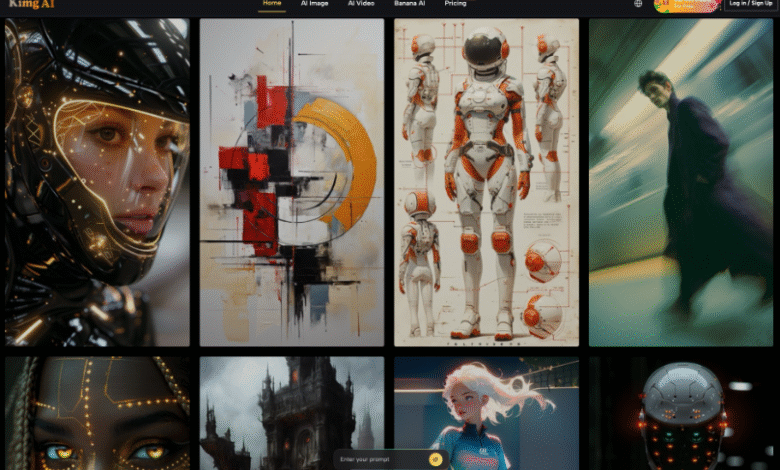
Use Nano Banana AI only after drawing that boundary. Kimg AI can build an explanatory backdrop or simplified object scene; it cannot supply a missing route fact or turn an unwitnessed event into evidence.
Find The Category Error Before Designing
Start by naming what the visual is supposed to be. A route diagram explains a relationship. A file photograph documents a place at a particular time. An editorial illustration interprets a subject. Trouble begins when one category is designed to look like another.
Write The Intended Category Above The Brief
Use a direct label such as “schematic route explainer” or “editorial illustration of ticketing confusion.” This label is not decorative metadata. It tells the designer which details may be simplified and which impressions must be avoided. A schematic may compress distance; a documentary image may not invent a crowd.
List The Claims A Reader Could Infer. Look at the proposed image without its caption. Could a reader infer that a named station flooded, that a collision occurred or that a particular operator caused the delay? If the article does not support that inference, remove the cue. Generated realism raises the standard because readers naturally treat photographic detail as evidence.
This is not a ban on the atmosphere. A flat, clearly illustrative platform silhouette can help orient a story about boarding flows. The risk comes from specific, plausible details that look observed but were actually invented.
Lock Route Facts Outside The Generated Image
Keep names, times, line colors, platform numbers and arrows in a normal graphics or publishing layer. They need to remain searchable, editable and easy to correct. Do not generate a complete map as pixels and hope every label survives.
Build A Small Fact Ledger First
A fact ledger can be a four-column table held beside the design. It records the statement, source, display form and final check. The visual team should not improve or simplify the statement without sending it back to the reporter.
| Fact type | Editable display | Generated role | Final check |
| Station name | Live text label | None | Exact spelling |
| Closed segment | Line and endpoints | Optional neutral texture | Correct extent |
| Replacement route | Arrow and written direction | Vehicle icon style only | Direction matches notice |
| Cause not confirmed | Omit | No incident scene | No implied explanation |
This division lets the newsroom update one time or endpoint without regenerating an entire illustration. It also makes corrections visible instead of burying them inside pixels.
Keep Numbers And Arrows In Editable Layers. Even strong text rendering is not a reason to lock operational information into an image. A generated arrow may bend around an object or point the wrong way. A time may look correct at a glance and still contain a substituted digit. Use the model for visual context, then add the factual marks with ordinary layout tools.
Generate Only The Separate Explanatory Image Layer
Once the fact layer is fixed, define the smallest useful generation job. It might be a simple overhead station shape, a neutral train silhouette or a sequence of objects that shows tap, transfer and exit. The prompt should state that the scene is illustrative and should avoid real logos, readable signs or identifiable incident details.
Choose A Model For The Visual Job. Google describes Nano Banana 2 as a general-purpose image model with multiple reference inputs, consistency and output up to 4K; Nano Banana Pro is positioned for more complex composition and precise control. On Kimg, choose between them for illustration style and layout difficulty, never for route logic.
Use Style To Signal Illustration Clearly. Paper cut, restrained isometric shapes, clean line art or a limited geometric collage can make the explanatory status visible. Photorealism is a poor default when the article lacks a documented scene. If a generated visual resembles a news photograph, the caption has to work too hard to undo the first impression.
Kimg AI can be useful here because the same basic object arrangement can be explored in several clearly illustrative styles. Keep the factual overlay absent during those generations. Add it only after choosing the visual shell.
Store the selected shell as a versioned asset rather than a finished news graphic. The map editor should be able to replace the route overlay without touching the generated layer. That separation also makes correction notices easier: readers can see that a time or endpoint changed, while the neutral illustration remains only a visual aid.
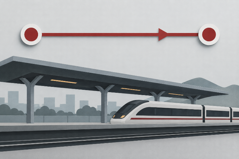
Test The Diagram Without Its Caption
Show the assembled visual to someone who has not read the story and hide the caption. Ask what happened, where it happened and what caused it. The answers reveal whether the explanatory layer has smuggled in a claim.
Record the first answer before discussing the brief. A corrected answer after explanation does not erase the image’s initial implication.
Reject Specific Events The Story Never Reported
If the viewer says “there was a signal failure” because the illustration shows a damaged signal, remove it. If they identify a specific station because of a generated sign, remove the sign. The test is not whether the inference sounds plausible; it is whether the article establishes it.
Keep The Useful Relationship After Simplifying. Do not strip the image until it says nothing. Preserve the relationship the diagram is meant to teach: where passengers leave one service, how a replacement route reconnects or which segment is affected. Simplify the atmosphere, not the verified relationship.
Limits For Generated Scenery In Transport News
Google applies SynthID to images generated with its Nano Banana models, but a watermark does not explain the newsroom’s sourcing or the specific boundary between fact and illustration. Any Kimg AI output still needs a clear caption and an internal record of which parts were generated. If an image could reasonably be mistaken for a photograph of the event, use a different visual treatment.
Publish The Diagram That Preserves The Facts
Kimg AI suits a transport desk that already has verified route information and needs a distinct explanatory layer around it. It does not replace the map file, reporter’s notes or operational notice.
Keep facts editable, generate only the visual shell, and run the caption-free inference test. The right image is the one that helps a reader understand the route without adding an incident, cause or location the story never proved.