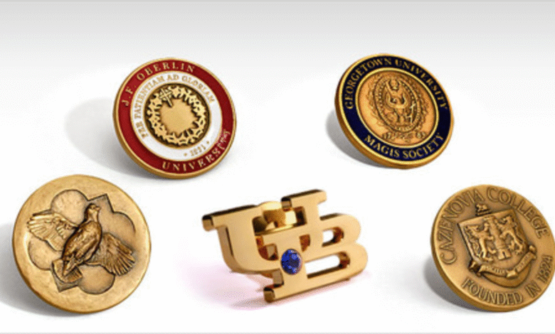
Lapel pins have been used for well over a century as markers of identity, membership, and recognition. What has changed significantly in recent years is the level of detail and craft that buyers now expect from them. Where a simple flat enamel badge once satisfied most organizational needs, decision-makers today — whether sourcing pins for corporate programs, trade associations, military units, or community events — are increasingly requesting dimensional designs that carry more visual weight and tactile presence. The result is a growing demand for pins that are not just functional identifiers, but objects people genuinely want to wear.
The challenge is that designing a pin with real dimensional quality requires more than uploading a logo and selecting a color palette. There are structural, material, and design decisions that directly affect whether the final product looks considered or looks cheap. Understanding those decisions before placing an order saves time, reduces revision cycles, and produces a pin that reflects well on the organization behind it.
What Makes a 3D Lapel Pin Different From Other Pin Types
A custom 3d lapel pin is defined by its use of raised and recessed surface layers to create a sense of depth and dimension. Unlike flat or soft enamel styles, where the design relies primarily on color fields and etched lines, a three-dimensional pin uses sculpted relief to communicate detail. The imagery does not just sit on a flat surface — it projects from it. This means fine elements like text, figures, or layered imagery can be rendered with a degree of realism that flat formats cannot achieve.
For organizations sourcing pins through a structured production process, working with a qualified producer of a custom 3d lapel pin means engaging with a process that includes mold creation, casting, and finishing — steps that require accurate artwork and clear design intent from the start. The distinction between a 3D pin and a standard die-struck pin is not just visual. It affects how artwork must be prepared, what tolerances are acceptable in the mold, and how much post-production finishing is required.
The Role of Relief Depth in Visual Quality
Relief depth refers to how far a surface element projects from the base of the pin. In three-dimensional pin production, this is one of the most consequential decisions a designer or buyer makes. Too little relief, and the pin reads as flat — the dimensional effect is lost and the final product delivers no advantage over cheaper alternatives. Too much relief, and the pin becomes structurally fragile, particularly in fine details like thin borders, small lettering, or narrow connecting elements.
Well-executed relief depth creates a hierarchy within the design. Elements that are meant to draw attention — a central emblem, a figure, a key symbol — project further. Background elements sit lower. This layering guides the eye and gives the pin a sense of craftsmanship that is immediately apparent when held. Organizations that skip this consideration during the design phase often receive pins that look acceptable in a digital proof but feel underwhelming in person.
Why Flat Designs Do Not Always Translate Well
One of the most common mistakes in pin design is submitting flat artwork and expecting the production team to interpret it into a dimensional object without additional guidance. Flat vector files communicate shape and color, but they do not communicate which elements should be raised, which should be recessed, or how transitions between layers should be handled. Without that information, a manufacturer will make assumptions — and those assumptions may not align with what the buyer envisioned.
This disconnect between artwork intent and production outcome is a leading cause of revision cycles, delayed delivery, and dissatisfied end users. The solution is to treat the design process as a three-dimensional exercise from the beginning, considering the physical form of the pin alongside its visual appearance.
Design Considerations That Affect Wearability
A pin that people actually want to wear has to satisfy two conditions: it must look appropriate in context, and it must feel comfortable and secure when worn. These are not aesthetic concerns alone. They are practical ones, and they are influenced by choices made long before a pin goes into production. Size, weight, finish, and attachment hardware all contribute to how a pin is received by the person wearing it.
Proportional Sizing and Visual Balance
Size affects both the visual impact of the pin and its perceived value. A pin that is too small loses its detail when worn — especially with dimensional elements that depend on depth to be legible at a glance. A pin that is too large becomes unwieldy and may not sit flat on lighter fabrics or lapels. The goal is to find a proportion where the design elements are readable, the relief depth is perceptible, and the overall object feels appropriate for its intended use.
For formal contexts — annual award programs, commemorative events, military or government affiliations — a slightly larger pin with restrained detailing often reads as more authoritative. For employee recognition or community programs, a smaller, cleanly designed pin tends to be worn more consistently because it integrates more naturally into everyday attire. Neither approach is universally correct. The right size depends on where and how the pin will be used.
Finish Choices and Their Effect on Perception
The finish applied to a 3D lapel pin has a significant effect on how the dimensional elements read under different lighting conditions. Polished metallic finishes reflect light in ways that emphasize the contrast between raised and recessed areas, which can enhance the three-dimensional effect significantly. Matte or antiqued finishes reduce that reflectivity, which can give the pin a more traditional or understated appearance — appropriate for some organizational contexts and less so for others.
Antique finishes, in particular, are well-suited to three-dimensional designs because the darkening of recessed areas naturally increases contrast, making the relief structure more immediately visible. This is why many military, heritage, and ceremonial pins use antiqued gold or silver — the finish does some of the visual work that paint or enamel would otherwise need to do.
Attachment Hardware as a Practical Concern
The back of the pin is rarely considered during the design phase, but it has a direct effect on whether the pin gets worn or sits in a drawer. Standard butterfly clutch attachments work adequately for lighter pins but can allow rotation and drooping on heavier dimensional designs. Locking pin backs provide more security and are worth specifying for pins that will be worn regularly or in environments where the pin’s orientation matters — such as uniform applications or formal event wear.
Organizations sourcing pins in volume should also consider whether the attachment hardware is consistent with the expectations of their audience. A high-quality pin with an inexpensive, loose clutch sends a conflicting message about the value of the recognition it represents.
Artwork Preparation and Working With Production Teams
The quality of a finished 3D lapel pin is directly connected to the quality of the artwork provided at the start of the process. This is not simply a matter of file resolution or format. It is about how clearly the design communicates spatial intent — which elements sit in front, which sit behind, and how transitions between those layers should be handled in the physical mold.
Preparing Layered Artwork for Dimensional Production
Production teams working on three-dimensional pins rely on artwork that communicates more than color and shape. Annotated design files — where different elements are labeled by intended relief level — significantly reduce the likelihood of misinterpretation during mold creation. Even a simple written description of the design intent, submitted alongside the artwork, can prevent costly corrections after a sample has already been produced.
Designers unfamiliar with pin production often benefit from reviewing the design guidelines provided by the manufacturer before finalizing artwork. Many production-related errors, including elements that are too fine to be cast clearly or text that becomes illegible at the finished pin’s scale, can be identified and corrected before any physical work begins. Catching these issues in the design phase costs nothing. Correcting them after mold production is both expensive and time-consuming.
The Sample Review Stage
Most professional pin producers offer a sample or pre-production proof before committing to a full run. This step is often treated as a formality, but it is one of the most important quality checkpoints in the entire process. A physical sample reveals aspects of the design that a digital proof cannot — how the relief depth reads under natural light, whether the finish achieves the intended effect, and whether the attachment hardware functions appropriately with the pin’s weight and balance.
As noted in production standards recognized by the International Organization for Standardization, the review of physical samples prior to full production is a standard practice in custom manufactured goods precisely because it identifies discrepancies between design intent and production output before they are replicated across an entire order. Skipping this step to accelerate delivery timelines is a common source of dissatisfaction in bulk pin orders.
Common Design Mistakes That Reduce Wearability
Several recurring design errors consistently produce pins that fail to meet buyer expectations. Understanding these patterns helps organizations avoid them, regardless of whether they are working with an in-house designer or briefing an external production team.
• Overloading the design with too many elements at the same relief level, which flattens the visual hierarchy and undermines the three-dimensional effect entirely.
• Using very fine text or thin line elements that cannot be accurately reproduced in metal casting and become blurred or indistinct in the finished pin.
• Choosing a finish that conflicts with the intended use — for example, a high-gloss finish on a pin intended for outdoor or uniform wear, where it may appear incongruous with the surrounding context.
• Failing to specify attachment hardware appropriate for the pin’s weight, resulting in a product that does not stay in position when worn.
• Submitting color-only artwork without any guidance on dimensional structure, leaving the production team to make decisions that should be the buyer’s to make.
Conclusion
Designing a lapel pin that people genuinely want to wear is not a matter of finding the most elaborate or technically complex design. It is a matter of making a series of careful, interconnected decisions — about proportion, relief depth, finish, hardware, and artwork clarity — that together produce an object with real presence and lasting value.
The organizations that consistently produce successful custom pins are not necessarily those with the largest budgets. They are the ones that treat the design process seriously from the beginning, communicate clearly with their production teams, and review physical samples before committing to a full run. When those steps are followed, the finished pin reflects well on everyone whose name is associated with it — and it is far more likely to end up on a lapel than in a keepsake box.